Thursday, 14 April 2016
final
This is my final magazine cover. I wanted to make it look a little bit retro. My model's hair is wild and her clothes are casual. I decided to go with a Teen Vogue cover because I wanted my audience to be teenagers, aged 15-19 or maybe even a little bit older. I matched my headings and sub headings with the things that young females may like.
This is my spread sheet. It looks a bit less professional but I decided to go with a plain and clear look. I've used a lot of photos and I added descriptions saying how much each thing costs. I tried to make it look very summery but also I decided to use photos of more expensive things, to not make it look like a cheap magazine.
fashion shoot edited
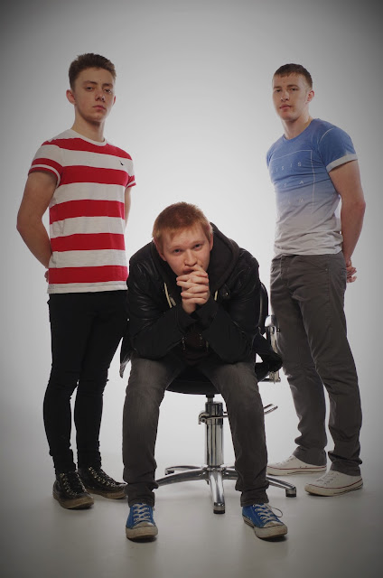
In the studio I wanted to get clear and bright photographs because that's what I've seen in my magazines researches.
I've used soft box, beauty dish and a snoot. I wanted to try out different things while having in mind my main outcome. I found experimenting rally helpful and I loved using a soft box. It creates a clear photo, without any shadows and distractions. It's also good for photographing details and clothing.
To create some shadows in the background, I used a snoot and a beauty dish on the side. I like this effect because it's still clear but not as bland.
Subscribe to:
Posts (Atom)


